Etheleo
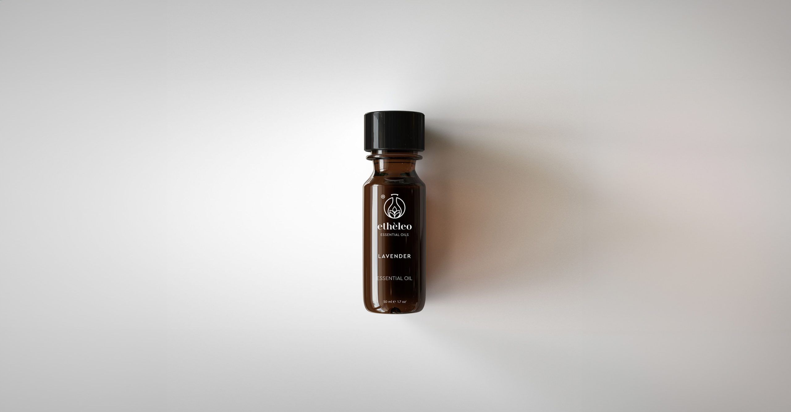
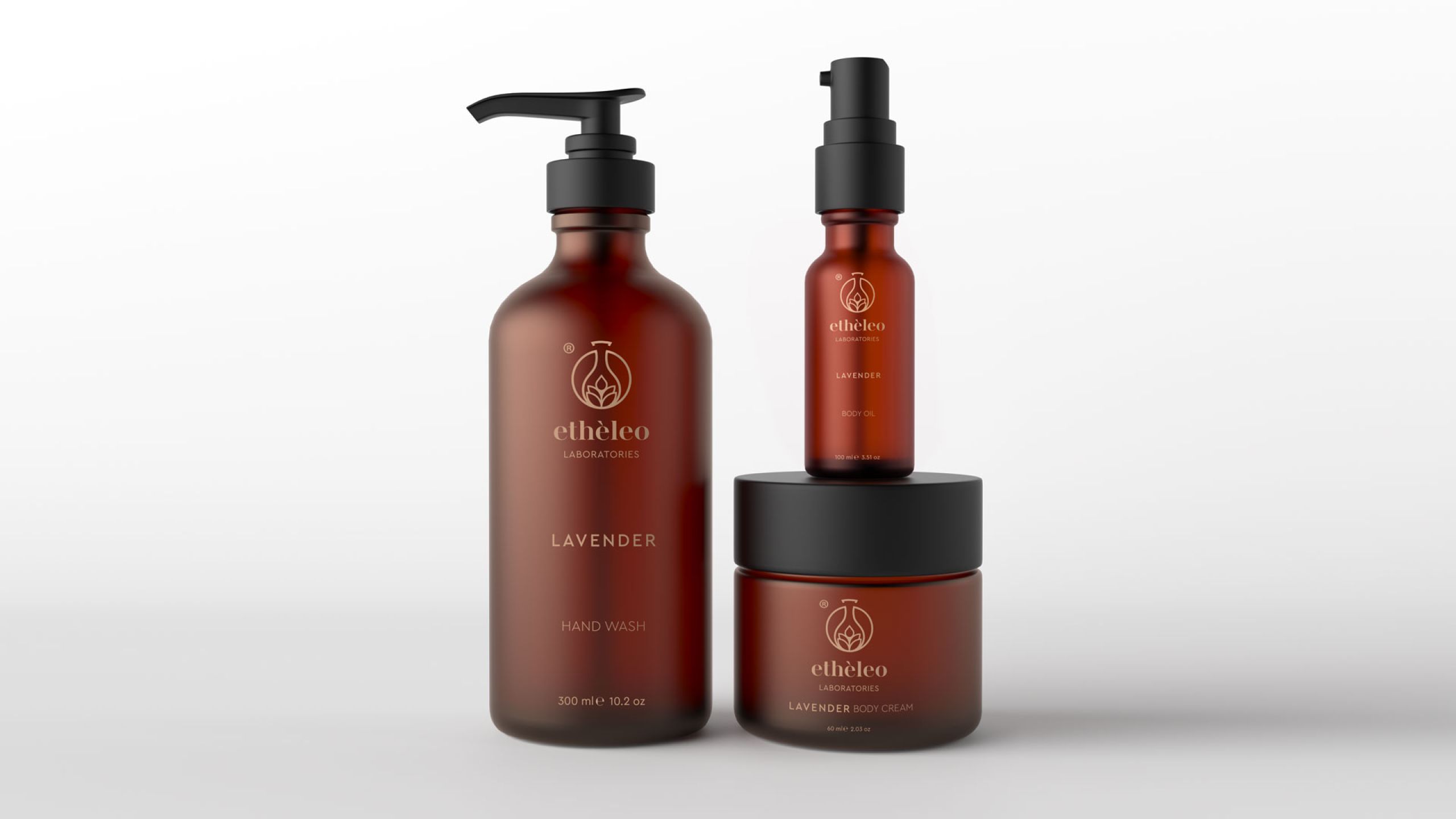
Βranding and logo design for ETHELEO a premium essential oils company.
Etheleo
Βranding and logo design for ETHELEO a premium essential oils company.
-
ClientERMINA LAZARIDOU
-
ScopeBranding, Logo design
-
SectorCosmetics & Wellness
-
Year2019
ETHELEO ESSENTIAL OILS is a vertically integrated production unit, covering the full cycle from organic cultivation of aromatic plants to the distillation of high-purity essential oils. The brand is aimed primarily at the perfumery and personal care industries, offering natural raw materials of exceptional quality.


The name Etheleo combines the English word Ethical with the Greek-rooted Éleo (meaning “oil”), expressing both the ethical philosophy behind the production process and the nature of the product itself. The creative direction focused on developing a logotype with authority, clarity, and visual dynamism — a mark that communicates the premium character of the brand while incorporating discreet and meaningful visual references: organic cultivation, scientific distillation, and lab-grade production.


The natural — and by extension, organic — identity of the brand is symbolised through a stylised lavender stem, chosen for its associations with purity and its strong link to the essential oils category.


The result is a refined, contemporary logo with a clear visual structure and strong symbolic language. A visual mark capable of supporting the brand’s positioning in the essential oils market.


