TORC
Branding & packaging design for industrial lubricants.
TORC
Branding & packaging design for industrial lubricants.
-
ClientINMARS SA
-
ScopeBranding, Packaging design
-
SectorIndustrial Equipment
-
Year2023
-
Credits
3D Modeling Poppy Studio
-
Distinction
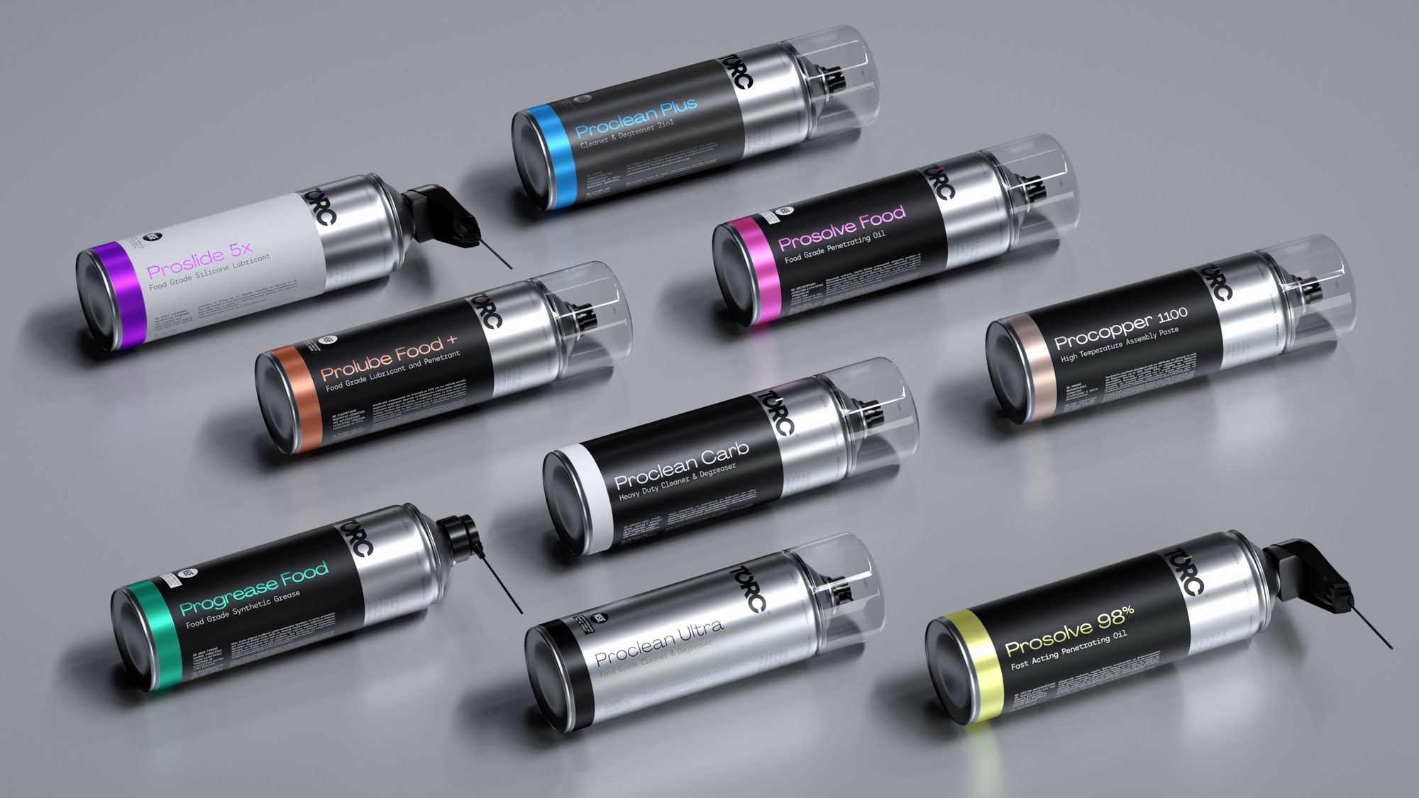
TORC is a new range of products for the lubrication and maintenance of industrial machinery — with a clear emphasis on technical precision and long-term durability. The packaging design was built around this identity: functional, robust, and fully aligned with the brand’s industrial character.


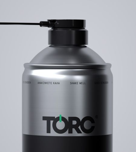
The logotype expresses mechanical precision and the concept of torque through strict geometry and compact form. Its circular structure suggests continuity and motion — fundamental concepts within the field. The typography is bold and heavy, crafted to convey confidence and professionalism.

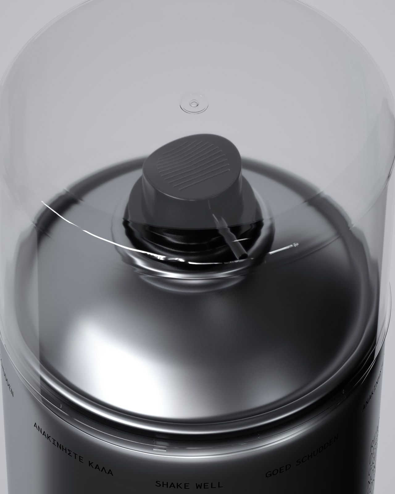
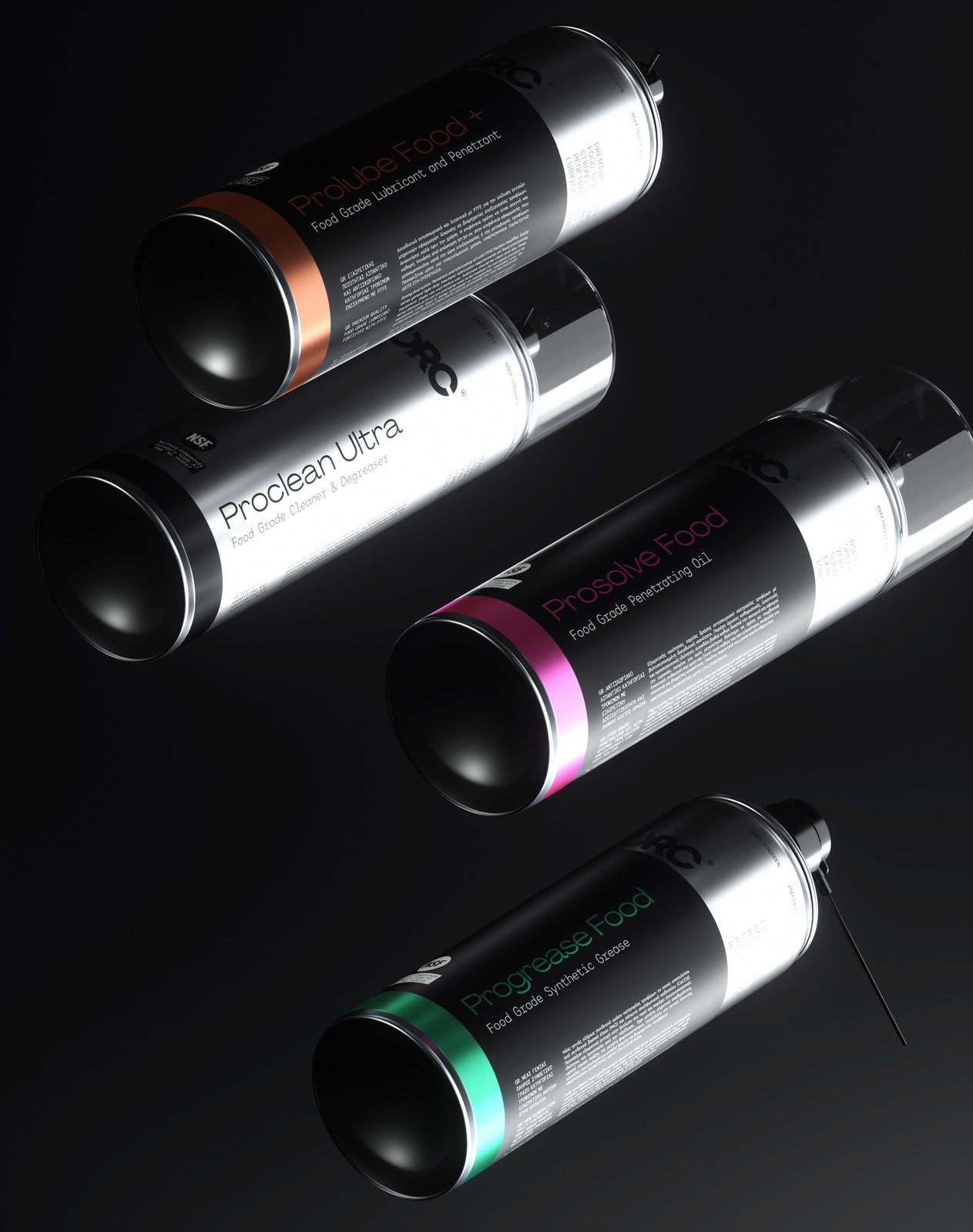
The packaging utilizes metallic textures and color combinations inspired by the industrial environment itself: aluminum tones, graphite gray, and high-contrast accents that support visual coding. The result is a clean, recognizable design that stands out even in the demanding environment of a factory.


The visual language, detailing, and label finishes were all designed with clarity and practicality in mind. Every graphic element serves a purpose — to reinforce the perception of quality and communicate the brand’s technical expertise.


TORC’s branding is a fully integrated solution for a high-demand product. From identity and logotype design to the full packaging system, every component strengthens the brand’s technical profile and defines its position in the industrial equipment market.

