Spready’s
Packaging design for a new line of nut butters – Gluten-Free & Palm Oil-Free
Spready’s
Packaging Design for a New Line of Nut Butters
-
ClientRETROGUSTO
-
ScopeBranding, Packaging design
-
SectorDelicatessen / Gourmet Foods
-
Year2021
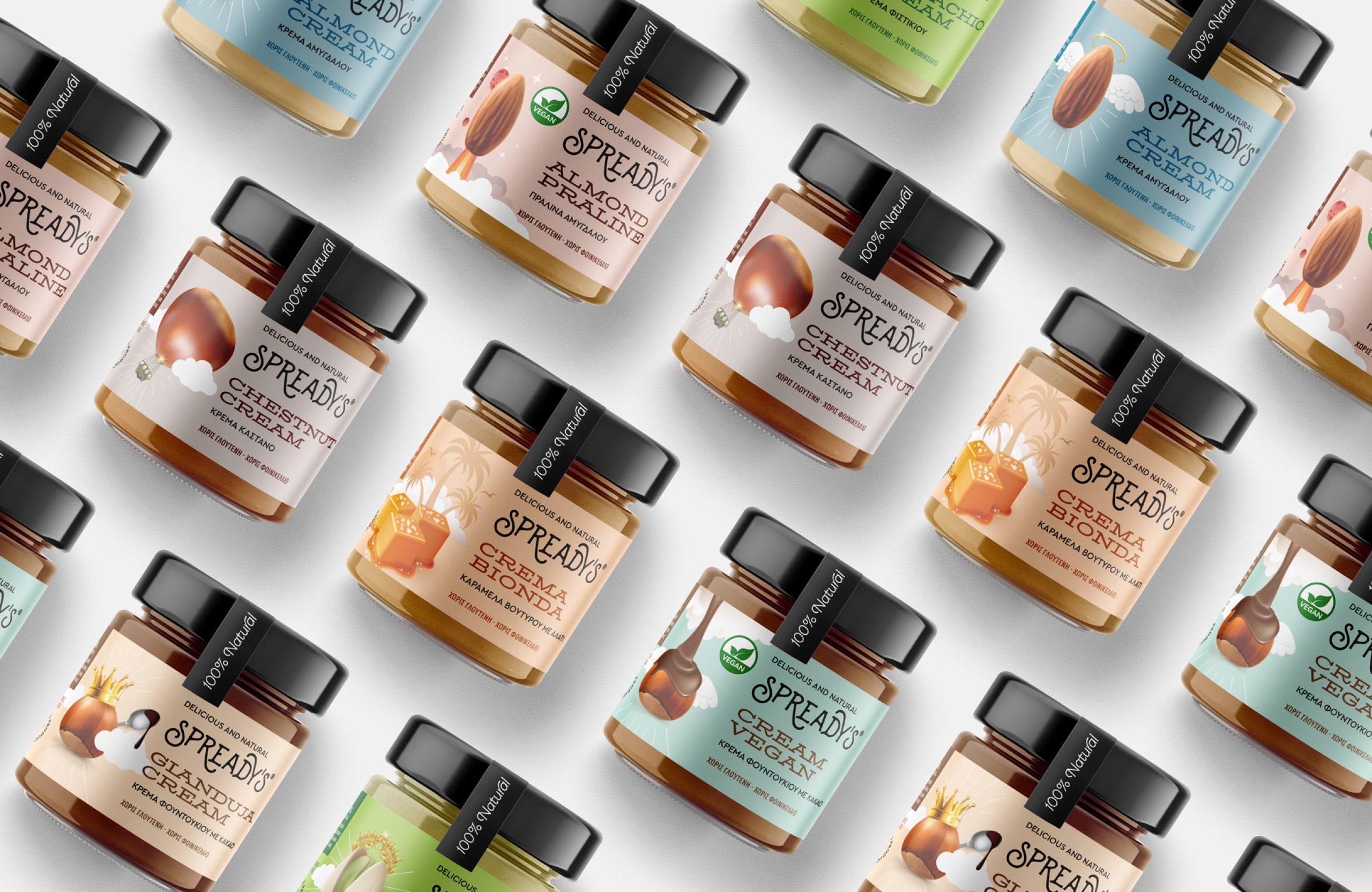
Spready’s is a bold new range of nut butter spreads that redefines the link between indulgence and healthy eating. Free from gluten and palm oil, made with clean ingredients and high nutritional value, the series was born to challenge the belief that delicious always means unhealthy.


The packaging design was driven by a need for differentiation — both visually and strategically. In a market saturated with earthy tones and generic wellness claims, Spready’s needed to stand out with clarity and confidence.
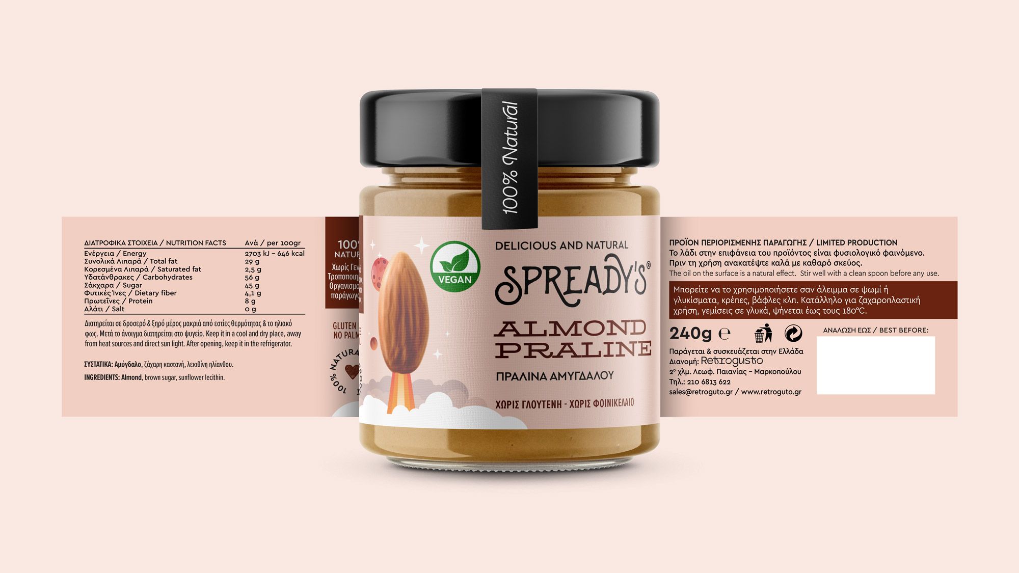
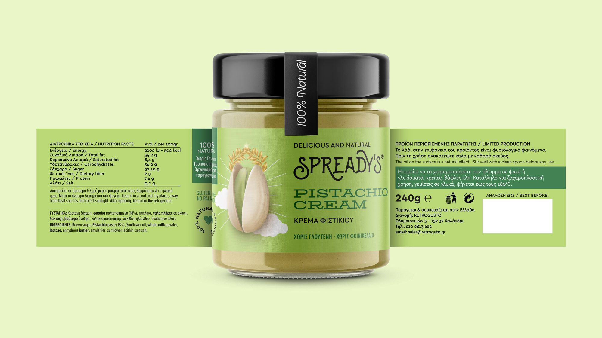
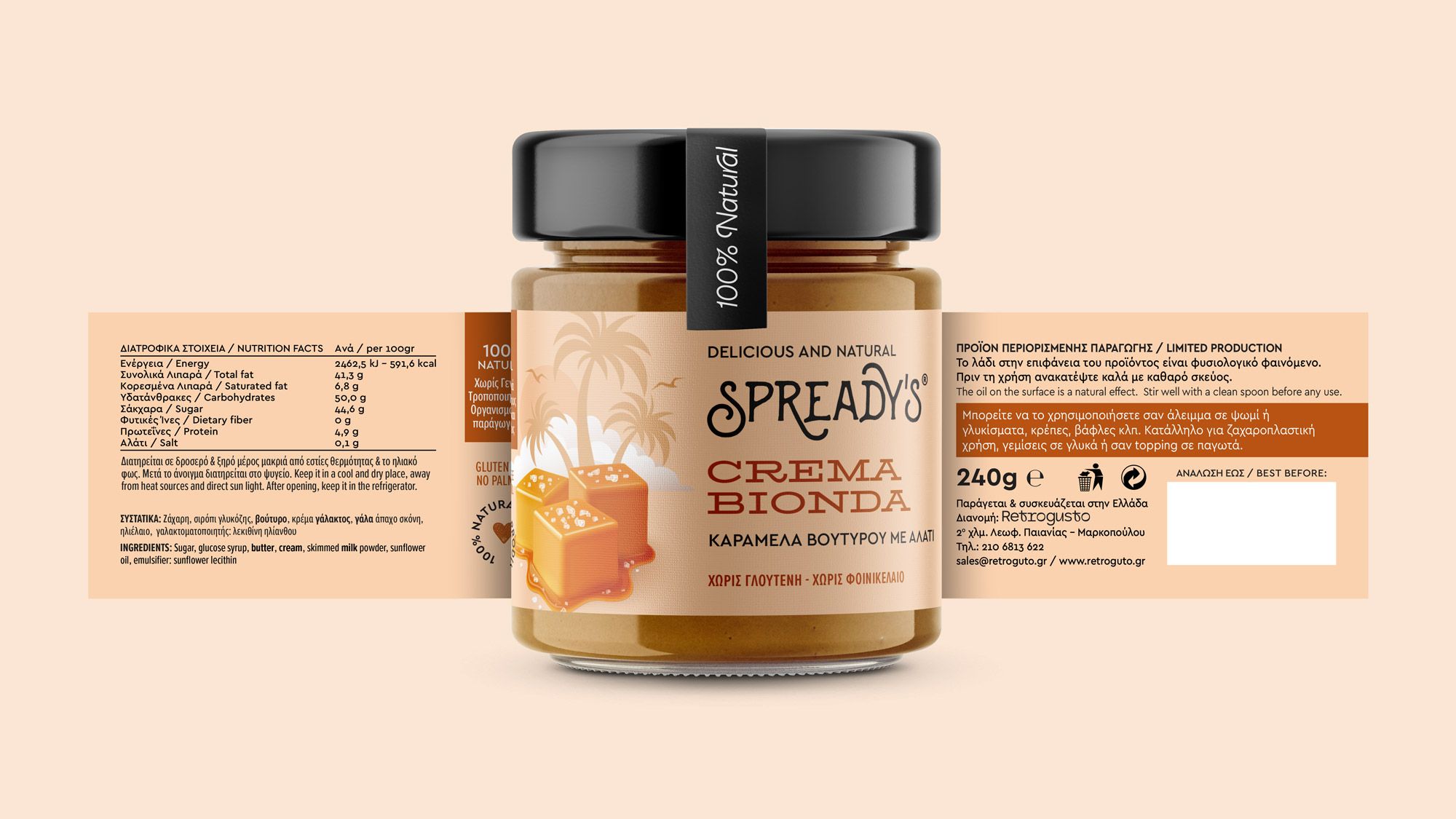
The visual identity is built around vivid colors and surreal illustrations, capturing the playful and imaginative personality of the brand. Our goal was to create a packaging system that evokes joy, sparks curiosity, and establishes a memorable shelf presence.


Each label tells its own story, using visual cues that relate to the key ingredient of each product — boosting recognition without sacrificing creativity. The verbal identity is equally considered: direct, friendly, and honest. A tone of voice that mirrors the brand’s mission to make good nutrition both fun and flavorful.


Spready’s doesn’t follow category norms — it questions them. And in doing so, it builds a bold visual language that reflects the product, its values, and the audience it’s meant for.

