Pyrgiotiko
Premium packaging design for traditional sausages.
Pyrgiotiko
Premium packaging design for traditional sausages.
-
ClientMALLIOPOULOS BUTCHER SHOP
-
ScopeBranding, Naming, Packaging design
-
SectorDelicatessen / Gourmet Foods
-
Year2018
-
Distinction
HiiiBRAND AWARDS 2017 — Merit Award
Featured — FAVOURITE DESIGNS 2018
Featured — Packaging Of The World
-
Publications
-
-
Pyrgiotiko is an award-winning traditional sausage, crafted with authentic recipes and locally sourced ingredients from the region of Ilia. For the launch of a limited edition series featuring five distinct flavors, Malliopoulos Butcher Shop entrusted our studio with the full packaging design.


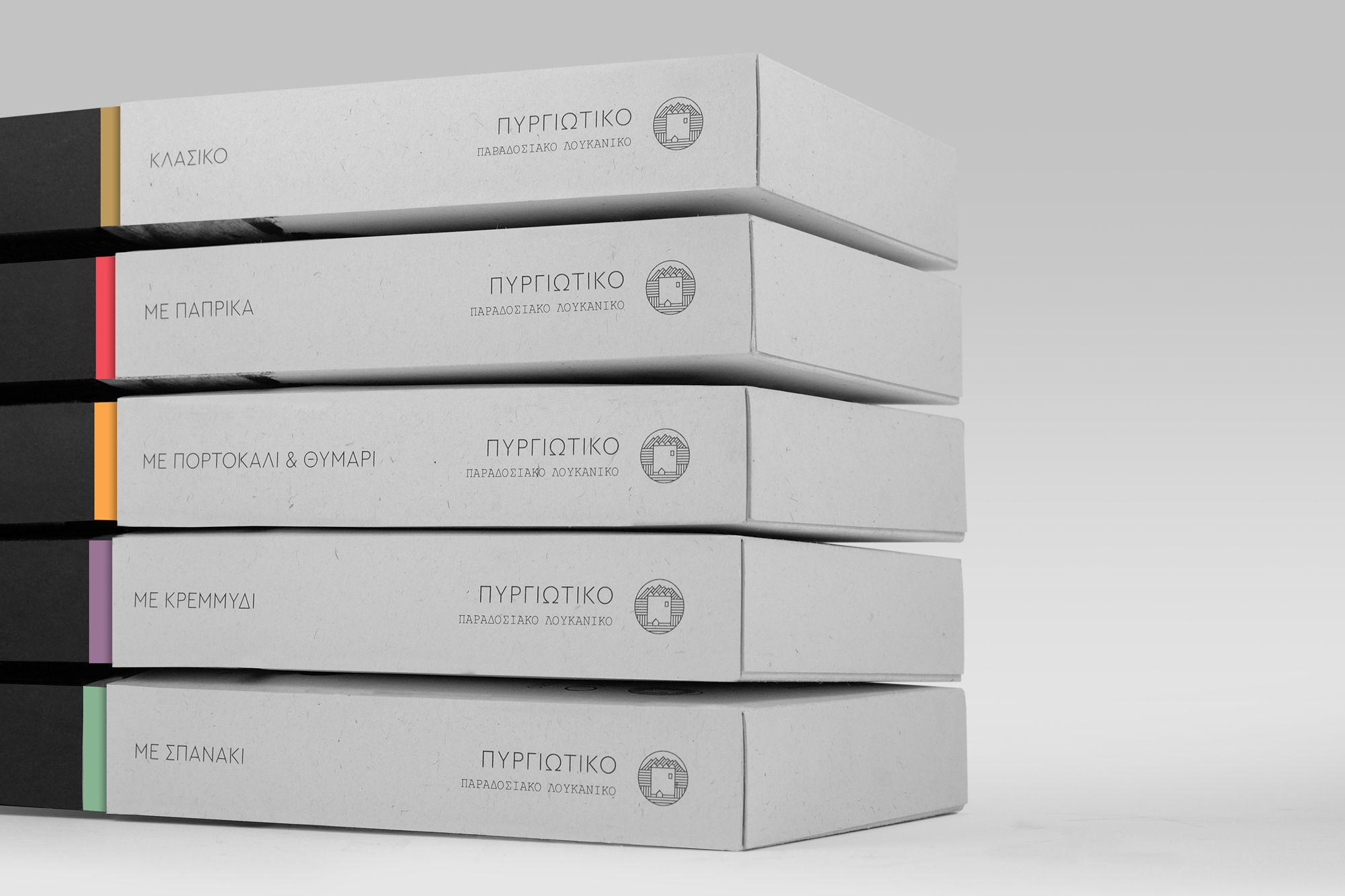
The goal was to create a visual identity that would communicate both the geographic origin and authenticity of the product, while clearly standing out from competitors. The name Pyrgiotiko (literally “from Pyrgos”) was proposed and adopted to root the brand in its place of origin and act as a distinctive mark. The tower symbol — a visual nod to the town of Pyrgos — complements the brand name, reinforcing the sense of provenance.


The design moves within a black-and-white visual framework, allowing the natural texture of the packaging material to emerge. Flavor differentiation is achieved through subtle color accents — gold, red, orange, purple, and green — establishing a cohesive but flexible chromatic system across the product range.


The packaging’s most recognizable element is the die-cut window. Instead of a generic geometric shape, we created a custom pattern inspired by the topography of the Ilia region. The angular form evokes the local mountain ridgelines while also forming the letter “M” — a direct reference to the Malliopoulos name. This symbolic duality links brand and origin in a single gesture, strengthening both recognition and storytelling.


For the typography, we combined a clean geometric typeface with a monospaced font to balance simplicity with character, ensuring clarity and hierarchy across all communication levels.


The final result is a packaging system that bridges traditional values with contemporary design — delivering a unified and immediate experience to the modern consumer.
