Plano
Identity design for the first digital orthodontics company in Greece.
Plano
Identity design for the first digital orthodontics company in Greece.
-
ΠελάτηςPLANO
-
ΥπηρεσίεςBranding, Visual Identity
-
ΤομέαςDigital Orthodontics
-
Έτος2023
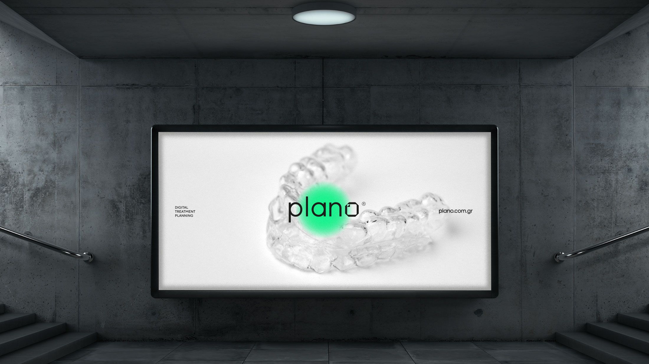
Plano is the first company in Greece to specialize exclusively in the digital planning of orthodontic treatments using clear aligners and advanced 3D technologies. The goal of the new brand identity was to clearly and contemporarily convey the core benefits of its services: precision, innovation, and complete digital control of the treatment process.


The design process began with the creation of a logo that embodies the technological precision and structural clarity that define Plano’s approach.
The brand symbol — a geometric form with angular curvature inspired by 3D digital modeling environments — replaces the letter “O” in the word PLANO.
It functions as a digital insertion within an otherwise analog word: the element that introduces the notion of digital planning into a traditionally analog concept, highlighting the company’s innovative nature.

The accompanying typography is strict, sans-serif, with structural consistency and a clean technological tone. Together, the logo and typography reinforce the values of precision, specialized expertise, and professionalism.


In brand applications, the symbol appears either as a solid 3D form or as a wireframe grid.
This grid structure directly references the 3D modeling software used by Plano in treatment design, while also serving as a visual metaphor for the brand name itself — Plano — evoking concepts of planning, structure, and digital control.


The color palette is bright and bold, with the vivid green reinforcing the technological nature of the brand and bringing freshness to the dental market.
Secondary brand assets — typography, icons, templates — were developed to maintain the clarity and consistency of the identity across every platform, from digital interfaces to printed materials.


The identity design for Plano goes beyond the creation of a logo.
It establishes a complete visual system — flexible, digitally driven, and ready to support the company’s pioneering role in the field of digital orthodontic treatment.


