Lifenest®
Packaging design for a new Generation of nutritional supplements.
Lifenest®
Packaging design for a new Generation of nutritional supplements.
-
ClientPharmalance
-
ScopeBranding, Packaging design
-
SectorCosmetics & Wellness
-
Year2023
-
Distinction
Featured — Packaging Of The World
Featured — World Brand Design Society
LIFENEST® brings together scientific knowledge and the power of nature, creating an advanced range of dietary supplements designed to support every aspect of well-being — physical, mental, and emotional.

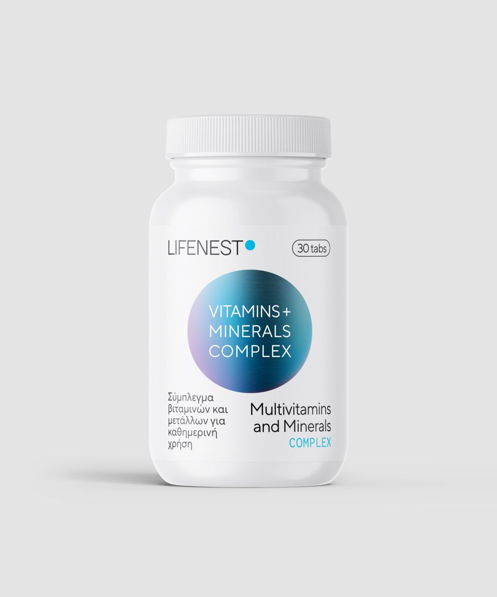
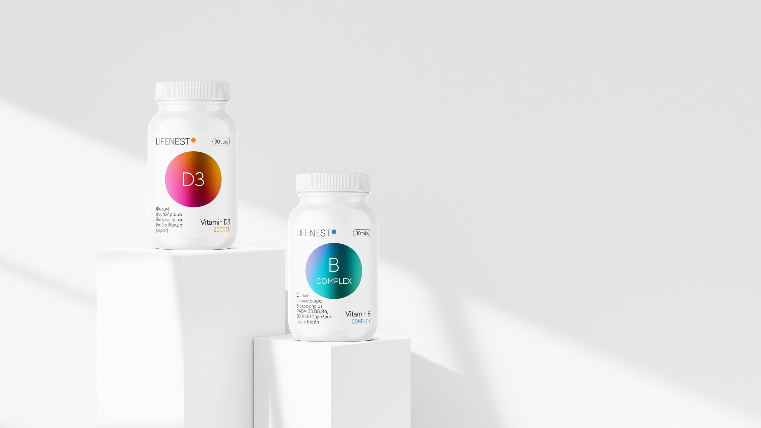
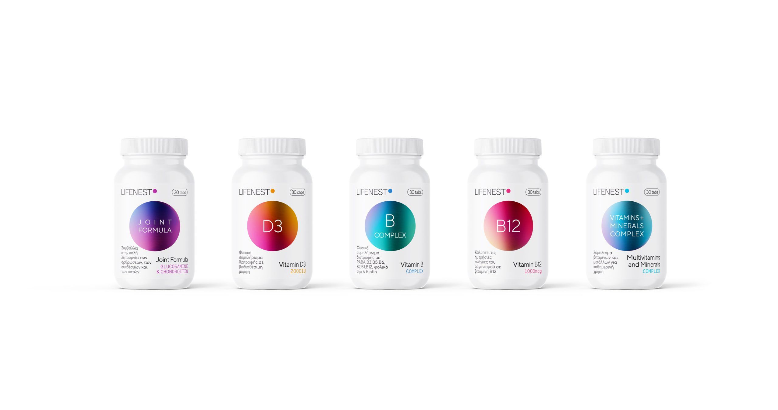
The packaging design was built upon this philosophy. The circle, the brand’s core graphic element, symbolizes continuity, vitality, and inner balance. It functions as a visual nucleus for each product — a consistent identity marker, with color variations that reflect the specific formula and intended benefit of each supplement.


The white background reinforces the brand’s purity and reliability, while the contrast with metallic, vibrant colors creates a dynamic, contemporary shelf presence. Each hue is carefully selected to represent a particular benefit — energy, focus, immunity, endurance — giving the series both visual consistency and practical clarity.


The packaging was designed not only to protect, but also to communicate. Through minimal aesthetics, balanced typography, and strategic color use, the design clearly conveys the brand’s core values: care, precision, and quality.

LIFENEST® positions itself in the market with confidence — a brand that speaks to an audience seeking both substance and style. A brand that nourishes the inside, without neglecting the outside.


