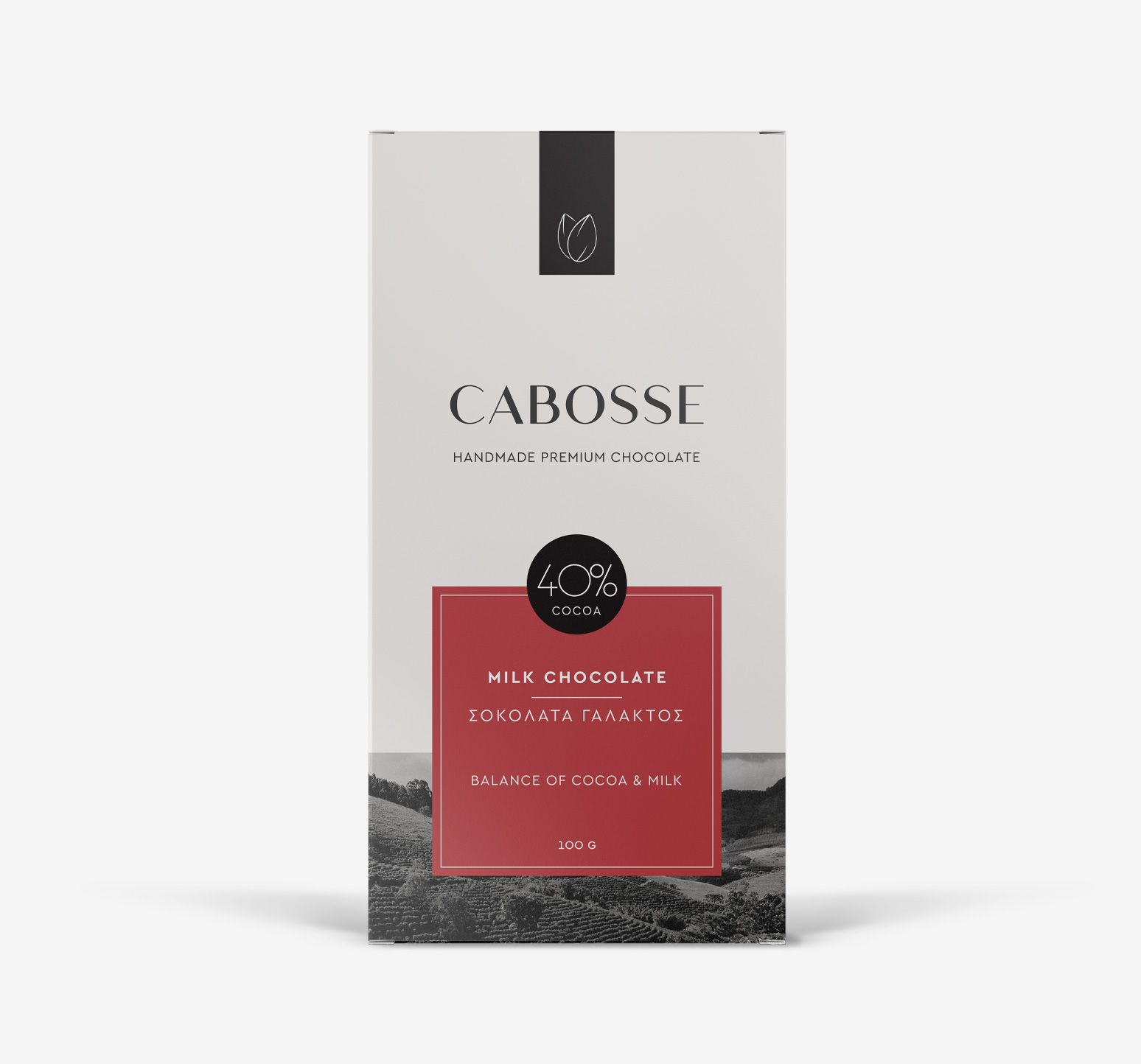
Cabosse
Premium chocolate packaging design, focused on elegance and origin.
Cabosse
Premium chocolate packaging design, focused on elegance and origin.
-
ClientRETROGUSTO
-
ScopePackaging design
-
SectorDelicatessen / Gourmet Foods
-
Year2020
Cabosse is a premium handmade chocolate, crafted from carefully selected, high-quality cocoa beans sourced from established plantations. The brand is centered on the purity of the raw ingredient and the pleasure of an authentic, strictly high-quality experience.


The main goal of the packaging design was to express this character: simplicity, clarity, and a premium visual aesthetic. The brief emphasized the need to differentiate the product from its competition through a refined image that would balance natural origin with contemporary design.


The core visual element is the cocoa bean, illustrated in a minimal form as a direct reference to the product and its production process. This element is consistently repeated across the series to enhance brand recognition and visual coherence.


Each flavor is distinguished through a dedicated color-coded label, creating an organized and multisensory system. The black and white background adds a timeless feel, while the photographic landscape featured at the bottom of each pack reinforces the notion of origin.

The color-coding system was designed to support the future expansion of the range — allowing for the seamless introduction of new flavors or cocoa percentages without disrupting the brand’s visual identity. A flexible framework that organizes, differentiates, and evolves with the product.

The typography is serif, set in uppercase, selected to amplify the sense of luxury while ensuring clarity and legibility. The result is a package that breathes — striking a balance between artisanal craftsmanship and premium positioning, confidently standing out on the shelf.

